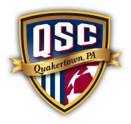
Travel Crest History
In the winter of 2011, the idea to develop a new crest for our Travel Soccer program was brought up in one of our General Membership Meetings. It was unanimous that we should move forward with the idea, and in late summer, 2011, a small committee was formed to develop the basic concept and design for a new crest. Special thanks to Travel Coordinator Kris Reiss, and club members Mike Suchanec and John Saugling, who worked with me on the initial Crest Development Committee. We took on the mission of “developing a fresh, new crest for QSC Travel Soccer that will be easily recognizable as the “brand” of a serious, top-level soccer program.” Our first step was to identify some existing logos and soccer crests that we liked, and pinpoint design elements that we wanted in our new crest, such as the basic shape, bold contrast, and possible color schemes.
We decided from the beginning that it was critical to have symbolism integrated throughout the design. For several months, we researched the history of the club and the town, and searched for some type of a “mascot” or symbolic figure to represent the club. We could not find anything that we felt strongly about, so we concluded that we would need to depend on bold shapes in the design, and that we would prominently feature the letters “QSC” as the brand of the club.
The colors were not chosen lightly – navy blue, white, dark red, black and metallic gold. We chose to feature the colors navy blue and white to carry on the tradition of the club. Both black and dark red represent the quality and attitude of our players on the field, since both symbolize strength and aggression. In addition, the red represents courage and speed, and was also chosen because Quakertown is often called the “Heart of Upper Bucks County”. The gold is symbolic of hope, success and optimism, and also represents “the gold standard”, - something QSC is striving to be in the soccer community.
Once we had the general design concepts and symbolism finalized, we solicited the general club membership for design ideas – and received several helpful ideas. Then, in early December I met with Graphic Designer Gary Knize, from Harleysville, to create the final logo. Gary and I went through at least a dozen different versions and updates after our initial meeting, during which time I gathered important feedback from the QSC Board.
Our committee had expressed a strong desire to create something that was fresh and modern, but still brought to mind the antiquity and deep history of our town. Working with Gary, I believed we have achieved our goal through the combination of different text styles – the modern boldness of the letters QSC, and the old-style script font used for “Quakertown, PA” on the banner. In addition to colors, we incorporated other types of symbolism: three white stripes on the blue background, to symbolize the three townships within the geographic area of the club – Richland, Milford and Haycock. We also included three stars, to represent the three Boroughs within club boundaries – Quakertown, Trumbauersville and Richlandtown. My favorite part of the logo is the use of the stars to “suggest” a soccer ball, giving it the inescapable feel of a soccer crest without coming right out and displaying a soccer ball.
The end result is a crest design that I think we can all wear with pride! In my opinion it is clearly one of the best around. I look forward to seeing it grace the uniforms of our travel players next year, and for many years to come.


